Page 1 of 2
Natural Media
Posted: 18 Dec 2008, 13:52
by Sewie
The only grudge I have with TVPaint (9) is that the natural brushes still don't look natural enough to me.
Off course I'm spoiled with the magnificent brushes in Painter and I would wish that TVP will incorporate more brushes looking like those in their updates or future versions. It would also be so great if creating my own natural media was somewhat more accessible. Painter has an amazing brush creator wich works very intuitively. Something like that would be fantastic in TVP. It would tie in so wonderfully with TVPaint's approach/philosophy of hand drawn animation.
To me it is still very hard to create good custom brushes (oil paint, oil pastels, chalk, gouache, etc, etc) intuitively in TVP that do have that natural look.
Re: Natural Media
Posted: 18 Dec 2008, 16:20
by idragosani
Have you looked at the creation pack? It has something like 1500 new brushes in it (I can't vouch for them, as I do not yet own the creation pack).
Granted, TVP and Painter have different artistic focuses... Painter is intended to emulate real paint, canvases, etc where TVP is not. So not entirely fair to compare them...
Re: Natural Media
Posted: 18 Dec 2008, 17:09
by Peter Wassink
idragosani wrote:Have you looked at the creation pack? It has something like 1500 new brushes in it (I can't vouch for them, as I do not yet own the creation pack).
...
Unfortunately, at least to my judgement of the trial version, the creation pack is much more focused on 'fun' and not on offering useful artist tools.
I wonder how many of those 1500(!?) brushes would be really useful for an artist like
Sewie.
Sewie, i take it your experiment with a more solid edge to the watercolorbrushes were not completely satisfying?
maybe you could share your attempt here and also share what you are looking for. others could help you out.
the waterbrush you like so much was also a colaboration.
And i do agree with you that there is plenty room for improving the process of creating custombrushes.
Re: Natural Media
Posted: 19 Dec 2008, 01:15
by Sewie
idragosani wrote: Granted, TVP and Painter have different artistic focuses... Painter is intended to emulate real paint, canvases, etc where TVP is not. So not entirely fair to compare them...
I understand what you are saying. But TVPaint does try to emulate (and improve on) the paper-animation process/workflow. Artistically it would seem that it would only makes sense to try and emulate good pencils and other naturalistic media to draw and animate with.
Imagine the possibilities of the Painter brushes with the animation workflow of TVP! Animating in (real/natural looking, but digital) oil paint, pastels, acrylic brushes or whatever media. When I'm working with the pens and pencils in TVP I feel like it's already halfway there. But most brushes still looks (or feel) like video-effects to me. The eye just notices the patterns instantly.
The drawing engine is wonderful and the software is very intelligent. But all based on the classical principles of drawing by hand. It makes me desire drawing tools that will also look as real as possible. At the moment that is just not the case with the brushes in TVP. And it feels like such a shame to me because I think that's where most artists will want to go next when drawing and animation feels as good it does now in TVP.
And creating new brushes is not easy or very accessible if you don't want to dive into the whole programming side (entering commands, etc) of TVP. I want to draw and paint with it. Produce my animations professionally and not lose time figuring out the programming side of TVP, but spend my time on the artistic side of the program.
Don't get me wrong; I love the software! It just feels it's lacking that one aspect, that artistic feel, from being THE perfect drawing and animation tool.
I did look at the "Creation Pack" and I asked some friends and colleagues, working with TVP, if it would have what I'm looking for. But it doesn't seem to offer that I'm affraid.
Peter Wassink wrote:
Sewie, i take it your experiment with a more solid edge to the watercolorbrushes were not completely satisfying?
maybe you could share your attempt here and also share what you are looking for. others could help you out.
the waterbrush you like so much was also a colaboration.
And i do agree with you that there is plenty room for improving the process of creating custombrushes.
Yeah, it was a fiasco. I fiddled around with
Malcooning's wonderful watercolor brushes, but without succes. I'll try to post some visuals, and an explanation tomorrow, ok ?
Re: Natural Media
Posted: 19 Dec 2008, 09:11
by hisko
There is one set of brushes that looks quite natural to me, and you can find it here:
http://www.tvpaint.com/forum/viewtopic.php?f=11&t=2663 . And some of the standard brushes can be used as natural mediabrushes,
But I agree that most brushes look to digital. It would be so good if the team of TVpaint would hire an artist/programmer to create a basic set of natural media.
Asaf (Malcooning) made the watercolorbrushes together with Zigotto (and I sort of Betatested it). I am sure that they would be able to make a lot of natural media brushes if they had enough time and the motivation to do that.
Real oilpaint, gouache, pastels and watercolors will always remain superior to the digital lookalikes, so for backgroundpaintings it's better to use real paint, but it would be nice if tvpaint had the possibility to simulate more sorts of natural media to match the character-animation with the painted backgrounds.
The brushes in the creationpack are usable, but they look a little bit too digital for this purpose.
It would be nice if tvpaint would make a distinction between 'funbrushes' and 'natural media brushes' so that new users will find their way in Tvpaint without being put off by some of the lunaparkbrushes.
By the way, my 4 year old son and his little friends are real fans of the explodingbrush, it´s hard to let them draw on paper anymore.
Re: Natural Media
Posted: 19 Dec 2008, 09:24
by malcooning
Sewie wrote:creating new brushes is not easy or very accessible if you don't want to dive into the whole programming side (entering commands, etc) of TVP.
I agree that creating brushes is not a straight forward thing, and requires quite a bit of experimenting and, to some degree, understanding of how the ingredients of the brush engine work. But there is no programming involved at all. In fact, there is no way to enter commands into the brushes. The basis to the brush engine lies in combining brush animation (frames, like symbols in Flash) and flexibly controlled brush attributes.
Nevertheless, TVP is lacking in out-of-the-box good brushes, and brush variations. This should be improved dramatically. I believe the digital age brings drawing tools of a new ilk, and therefore the experimentation can yield an impressive array of reality-impossible brushes (which pushes drawing to a new level). So even if the simulation of real-world natural media is not in the pipeline, an addition of great-to-work-with brush should definitely be.
Re: Natural Media
Posted: 19 Dec 2008, 11:15
by slowtiger
Well, the Painter engine is completely built around "natural media" simulation, that's why the results are really convincing. But it is a slow program (last time I checked). In contrast, TVP only uses basic tool parameters in combination with animated brushes (the "bitmap as a brush" concept familiar from Photoshop and other programs), with more or less success - but it is fast.
I wouldn't like TVP to change into any direction which would make the program slower. But of course the interface always could be improved, and maybe some basic concepts as well. "Less is more" always sounded right to me, and I prefer a tidy interface with just a few buttons, where settings are accessible under each button, over an interface with all settings available on first level (as I perceive TVP right now).
My main source of frustration is that tool settings are stored at so many different places. To get a desired effect, I have to: check the tool settings, maybe check the tool bin, check the paper settings (and of course get the correct colour) - and switch between 3 palettes and several tabs. This is not only confusing but also quite time consuming, in terms of "mouse distance". Furthermore, I'm still struggling with customizing the tool palettes on the right side. Not that I am unable to use them, but I have to read up a lot to set them correctly, and that's always a sign for a counter-intuitive interface.
I think I'd prefer one single tool palette since I can use only one tool at a time anyway. If I use a drawing tool, it would show me the different drawing tool alternatives, if I use a selection tool, it would show me all other selection variants, and so on. This way I could get rid of a couple buttons in the main tool palette.
The alternatives in the tool palette would be those I have defined myself, or a default set. Right now the 10 options in the main Tool Palette at the left are not really tools, I understand them as different "models" from which I construct my own brushes and pens. My idea was to put these 10 models inside the tool settings. So the first level (the one you see after starting) would be a handful of brushes/pens, the second level would be the individual settings of these brushes/pens, where "tool model" would be just one option (a pulldown), and paper another.
Yes, I'd like to have the paper settings inside the brush/pen settings since it makes more sense this way (IMO). (I just realize that a diagram of tool and setting hierarchies would be handy right now ...)
The same concept would apply to the selection and move tools. I could have a number of selection tools, each complete with my personal settings, and switch between them with a key (E, right now). I think this has an advantage over the current arrangement where I have 5 buttons for only slightly different selection tools, but each of them only holds one setting. The emphasis would lie on the tools each user actually needs for the job, while safely storing away everything else (but available when needed). It would be great if this concept, implemented consequently, would lead to only one row of palettes again.
(I really should draw a sketch for this. Maybe the next days. Are you even interested in that?)
Re: Natural Media
Posted: 19 Dec 2008, 12:38
by Satrip
I think too that "natural brushes" are stil missing out-of-the-box in TVP, but as slowtiger I wouldn't like TVP to become as slow as Painter!

Also i agree that tools could be re-organised more intuitively .
Re: Natural Media
Posted: 19 Dec 2008, 15:42
by Sewie
I don't think anyone wants TVP to become slower.What I'm saying is that I desire good (or proper) naturalistic looking brushes (dry and wet media). And a little more practicality in creating my own brushes or adapting existing ones.
malcooning wrote:
I agree that creating brushes is not a straight forward thing, and requires quite a bit of experimenting and, to some degree, understanding of how the ingredients of the brush engine work. But there is no programming involved at all. In fact, there is no way to enter commands into the brushes. The basis to the brush engine lies in combining brush animation (frames, like symbols in Flash) and flexibly controlled brush attributes.
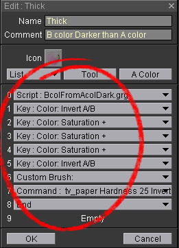
I was referring to these commands in the "brush edit panel":

Don't know if they should be called "commands", though. They look like commands to an novice.
malcooning wrote: So even if the simulation of real-world natural media is not in the pipeline, an addition of great-to-work-with brush should definitely be.
Hopefully it will be put in the pipeline in the near future. As great program like TVP deserves really great tools to draw and animate with, I feel.
Re: Natural Media
Posted: 19 Dec 2008, 15:58
by Sewie
Peter Wassink wrote:
Sewie, i take it your experiment with a more solid edge to the watercolorbrushes were not completely satisfying?
maybe you could share your attempt here and also share what you are looking for. others could help you out.
the waterbrush you like so much was also a colaboration.
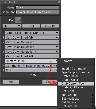
I tried to adapt Malcooning's watercolor brushes by changing his custom brush with my own (animated one). Hoping to get a somewhat less random edge around my brushstrokes than the watercolor brushes. (which, I repeat, I find to be fantastic brushes.)
So I swapped his custom brush for one that I had made by using the following command:

And the result was this:

I really don't like those hard edges (encircled with red). Looks and feels like another video affect to me. And I probably should have tried more different approaches and different custom made animated brushes... But so much other work to do.
Re: Natural Media
Posted: 19 Dec 2008, 19:30
by Fabrice
It's not perfect, but maybe can you share that panel ?

Re: Natural Media
Posted: 19 Dec 2008, 19:38
by Sewie
Which panel ? Do you mean the .tvpx file for the brushes I made ?
Re: Natural Media
Posted: 19 Dec 2008, 19:40
by Fabrice
yes, share it if you can, I'm sure that some users may help you to improve the small imperfections.

Edit : ok, I'm stupid, it's created from a panel already existing.

Re: Natural Media
Posted: 19 Dec 2008, 19:58
by Peter Wassink
slowtiger wrote:
(I really should draw a sketch for this. Maybe the next days. Are you even interested in that?)
Are you kiddin?
please do! Everyting you say in this post makes a lot of sense to me ...still words only go so far, a sketch would make it easier to understand.
Re: Natural Media
Posted: 19 Dec 2008, 19:59
by Sewie
I've put them in a new panel and posted them anyway.
They are all based on the brushes by Malcooning. "Malc's brush pressure" is excactly the same as his but I only adjusted the pressure settings in the size-profile editor. the other three are my attempts, using an animated custom brush of my own making.


