Image Marks Enhancement Suggestion

This section is dedicated to the feature & improvement requests (be sure what you are asking does not exist yet in TVPaint Animation ;) )
User avatar
Sewie
Posts: 1310
Joined: 18 Jun 2008, 11:57
Location: The Netherlands, Europe
Contact:

Image Marks Enhancement Suggestion

Post by Sewie »

Though I believe that the Imagemarks functionality in TVP can be a very powerful help, I must admit that I hardly use them. That's mostly because I think that they are not very clear within the timeline. I mostly use the bookmarks option which I think has a better visibility.

But I think that the Imagemarks could be just as powerful to use if they were clearer, so I've made some mock-ups:
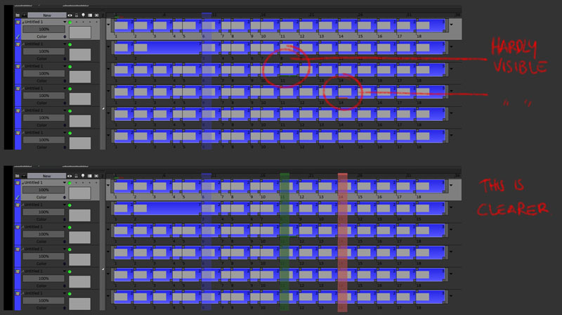
Image

In the lower version of the suggestion above the Imagemark are highlighted like Bookmarks are. Though I find that very clear I realise that it creates a problem when there are multiple Imagemarks on different layers in the same frame.

So below is another suggestion to make the magemarks more clear/visible.

Image

Does the TVP team think this would be possible to realise?
Does the user base think this enhancement is important enough?

Another feature that I would love is an option to highlight an Instance instead of only a frame. So that if I would have a hold for (let's say) 8 frames, I could mark that instance and all 8 frames would be marked with the Imagemark highlight. (Right now Imagemarks highlights just 1 frame)
Michael Sewnarain - Website
Windows 11/64b Pro - TVP11.7.0 & 11.7.1 - Pro/64b - Cintiq32 Pro - Intel i7-12700K - 64Gb RAM
User avatar
neonnoodle
Posts: 240
Joined: 22 Dec 2010, 14:17
Location: Boston, MA
Contact:

Re: Image Marks Enhancement Suggestion

Post by neonnoodle »

Sewie wrote: Another feature that I would love is an option to highlight an Instance instead of only a frame. So that if I would have a hold for (let's say) 8 frames, I could mark that instance and all 8 frames would be marked with the Imagemark highlight. (Right now Imagemarks highlights just 1 frame)
I like your second proposed system, where all exposures of the instance are marked. +1 to that.
User avatar
Paul Fierlinger
Posts: 8100
Joined: 03 May 2008, 12:05
Location: Pennsylvania USA
Contact:

Re: Image Marks Enhancement Suggestion

Post by Paul Fierlinger »

Boy! You sure live in a dark, dark world! I see the problem as image marks having the same colors as layer colors and there lies a conflict. I think layer colors should be on the pale side to better read the frame numbers whereas the image marks have the opposite function, which is to bring attention to themselves and should thus be made of striking colors.

Sewie, I bet that you would be perfectly happy with the image marks as they are, if they were made of bright colors, and if your layers were to be made of light colors, you would have no difficulty seeing how many instances follow a frame.
This whole issue could be solved just by giving us the opportunity to give image marks and layer colors their own color scale -- an issue that has been bugging me for a long time.
Paul
http://www.slocumfilm.com
Desktop PC Win10-Pro -64 bit OS; 32.0 GB RAM
Processor: i7-2600 CPU@3.40GHz
AMD FirePro V7900; Intuos4 Wacom tablet
User avatar
Sewie
Posts: 1310
Joined: 18 Jun 2008, 11:57
Location: The Netherlands, Europe
Contact:

Re: Image Marks Enhancement Suggestion

Post by Sewie »

Paul, the same problem occurs with different layer colors, the issue is that there is a very small area for the color indication of the image mark.
And I have tried the lighter interfaces of TVP, I find dark much easier on the eyes. That's just my preference.
...I see the problem as image marks having the same colors as layer colors...
That is not the case in my example. The imagemarks are green and (light) red and the green blends away in the blue. It happens with other colors as well.
...and if your layers were to be made of light colors, you would have no difficulty seeing how many instances follow a frame.
That's besides the point. I don't want to see HOW MANY instances follow a frame I want to see the imagemark quickly and clearly.

Another reason I don't like the lighter interfaces is that they tend to overshine when working with colors. You wouldn't know this because you never work with colors in the Project Window. Someone else does that for you. I find that a muted interface is best to be able to see and judge the intensity and the range of the colors in the project window. By the same logic that it is hard to watch television in sunlight or a projected movie in daylight.
Michael Sewnarain - Website
Windows 11/64b Pro - TVP11.7.0 & 11.7.1 - Pro/64b - Cintiq32 Pro - Intel i7-12700K - 64Gb RAM
User avatar
Paul Fierlinger
Posts: 8100
Joined: 03 May 2008, 12:05
Location: Pennsylvania USA
Contact:

Re: Image Marks Enhancement Suggestion

Post by Paul Fierlinger »

I practically "invented" TVP's black theme (well, there were a couple of us fighting hard for it way back before even Mirage happened) but you get my point, so I prefer dark interfaces as much as you do. Yet I have tweaked my Layers field as well as the BG of my project window to be a sort of medium to light gray, which makes quite a difference.

Otherwise I agree that the image marks would be more salient if they could be twice the current thickness AND have their own color scheme too. So I do agree that this area of the interface needs some work but I'm not sure I'd like to see image marks stretched out to half the length of a layer. It depends on how we use them, and I for one, use them to mark sync points between a stack of layers and to have each one of those end up being of different lengths would screw up the whole idea of maintaining sync points between layers which occasionally get accidentally moved left or right by a single frame.

EDIT: Just a reminder, sync points are often made where there are no open frames, or to put it in another way, in the middle of a layer's hold area.
Paul
http://www.slocumfilm.com
Desktop PC Win10-Pro -64 bit OS; 32.0 GB RAM
Processor: i7-2600 CPU@3.40GHz
AMD FirePro V7900; Intuos4 Wacom tablet
User avatar
Sewie
Posts: 1310
Joined: 18 Jun 2008, 11:57
Location: The Netherlands, Europe
Contact:

Re: Image Marks Enhancement Suggestion

Post by Sewie »

Paul Fierlinger wrote:I practically "invented" TVP's black theme (well, there were a couple of us fighting hard for it way back before even Mirage happened) but you get my point, so I prefer dark interfaces as much as you do.
I see. You fought the good fight then. Thanks for that!
...It depends on how we use them, and I for one, use them to mark sync points between a stack of layers and to have each one of those end up being of different lengths would screw up the whole idea of maintaining sync points between layers which occasionally get accidentally moved left or right by a single frame.

So then an option to mark the image by instance would not bother your workflow because the option to mark by single frame would still be there. And combined with an earlier feature request the option to mark by instance would work for you as well.
Michael Sewnarain - Website
Windows 11/64b Pro - TVP11.7.0 & 11.7.1 - Pro/64b - Cintiq32 Pro - Intel i7-12700K - 64Gb RAM
User avatar
Paul Fierlinger
Posts: 8100
Joined: 03 May 2008, 12:05
Location: Pennsylvania USA
Contact:

Re: Image Marks Enhancement Suggestion

Post by Paul Fierlinger »

No, that's another issue. If I am working with 10 layers and only layers 2,4,8 must stay positioned with each other while all the others can be shifted wherever, so I will create marks on a spot that corresponds with the sound track. Now I have added a few new frames to track 4 which shifted the whole track to the right by that those few frames. Now I add a few frames to track 8, but more frames than I had added to 4. And not just that, but I have loaded a completely new soundtrack so I have no common reference point by which to maintain sync except for those image marks that belong on top of each other.

Do you follow the gist of my point? This has nothing to do with maintaining tracks in the same position but the contrary -- continuously shifting tracks while only certain ones have to stay in sync with each other even though new frames get added or subtracted from each one, at some point they must get back into sync, which are those precious sync marks.

BTW, the marker color I use most often is pure white, which anyone can spot from afar and even if the tracks get scrunched up to a very small size of their natural length. This says something about how important it is to have bright colors.
Paul
http://www.slocumfilm.com
Desktop PC Win10-Pro -64 bit OS; 32.0 GB RAM
Processor: i7-2600 CPU@3.40GHz
AMD FirePro V7900; Intuos4 Wacom tablet
User avatar
Sewie
Posts: 1310
Joined: 18 Jun 2008, 11:57
Location: The Netherlands, Europe
Contact:

Re: Image Marks Enhancement Suggestion

Post by Sewie »

Okay. But I still don't see how my suggestions will encumber your workflow when they are about adding functionality and leaving those that are there now in place.
Michael Sewnarain - Website
Windows 11/64b Pro - TVP11.7.0 & 11.7.1 - Pro/64b - Cintiq32 Pro - Intel i7-12700K - 64Gb RAM
User avatar
Paul Fierlinger
Posts: 8100
Joined: 03 May 2008, 12:05
Location: Pennsylvania USA
Contact:

Re: Image Marks Enhancement Suggestion

Post by Paul Fierlinger »

If a Image Mark would cover all instances and not just the head image, how am I to make correct sync marks? A sync mark is one tic -- you are giving me lines. How is that a sync point? It's a sync area at the best.
Paul
http://www.slocumfilm.com
Desktop PC Win10-Pro -64 bit OS; 32.0 GB RAM
Processor: i7-2600 CPU@3.40GHz
AMD FirePro V7900; Intuos4 Wacom tablet
User avatar
Sewie
Posts: 1310
Joined: 18 Jun 2008, 11:57
Location: The Netherlands, Europe
Contact:

Re: Image Marks Enhancement Suggestion

Post by Sewie »

That's why I added the second mockup where I said this:
Another feature that I would love is an option to highlight an Instance instead of only a frame.
Did you not notice the part were I mentioned "option"?
Michael Sewnarain - Website
Windows 11/64b Pro - TVP11.7.0 & 11.7.1 - Pro/64b - Cintiq32 Pro - Intel i7-12700K - 64Gb RAM
Elodie
Posts: 13912
Joined: 06 Jan 2009, 09:53
Location: Metz

Re: Image Marks Enhancement Suggestion

Post by Elodie »

I like your second suggestion Sewie :)
User avatar
neonnoodle
Posts: 240
Joined: 22 Dec 2010, 14:17
Location: Boston, MA
Contact:

Image Mark multiple frames

Post by neonnoodle »

I often do all my keys/extremes first, and then want all the frames I just drew to be Image Marked. But as far as I can see, I have to set Image Mark 1 frame at a time. Can it be made possible to select many frames and Image Mark them all at once?
User avatar
Sewie
Posts: 1310
Joined: 18 Jun 2008, 11:57
Location: The Netherlands, Europe
Contact:

Re: Image Mark multiple frames

Post by Sewie »

+1.
I've made a somewhat similar suggestion before.
Michael Sewnarain - Website
Windows 11/64b Pro - TVP11.7.0 & 11.7.1 - Pro/64b - Cintiq32 Pro - Intel i7-12700K - 64Gb RAM
Elodie
Posts: 13912
Joined: 06 Jan 2009, 09:53
Location: Metz

Re: Image Marks Enhancement Suggestion

Post by Elodie »

I merged both, in order to avoid many topics for one feature :)
Elodie
Posts: 13912
Joined: 06 Jan 2009, 09:53
Location: Metz

Re: Image Mark multiple frames

Post by Elodie »

neonnoodle wrote:I often do all my keys/extremes first, and then want all the frames I just drew to be Image Marked. But as far as I can see, I have to set Image Mark 1 frame at a time. Can it be made possible to select many frames and Image Mark them all at once?
Todo listed :)
Post Reply